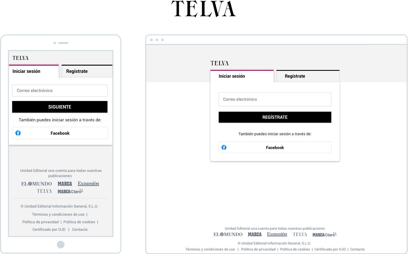
The designs and prototypes are visual references of the process, the final designs are not shown due to the client's product rights
The Unidad Editorial group needed to revamp both the visual design and usability of the login and registration process. The main requirement was to develop a design and functionality that could be applied consistently across the main mastheads, which include:
The UX team conducted user tests on each portal using the User Zoom tool. Estas pruebas recopilaron información valiosa que contribuiría a las mejoras del proceso de login y registro, tal como lo esperaban los stakeholders para optimizar el producto. After analysing the results, these were shared with the UI team to start the visual design process.
In order to develop a design system that would work uniformly and fit the look & feel of each of the web portals, a font was selected that would be compatible with all of them. The personalisation layer would be defined by:
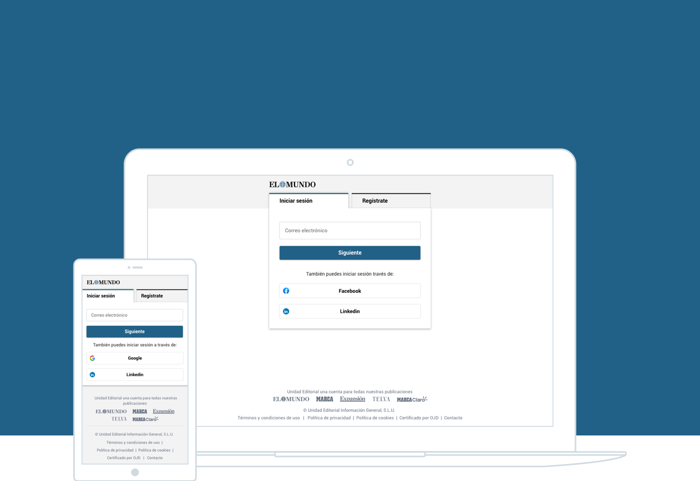
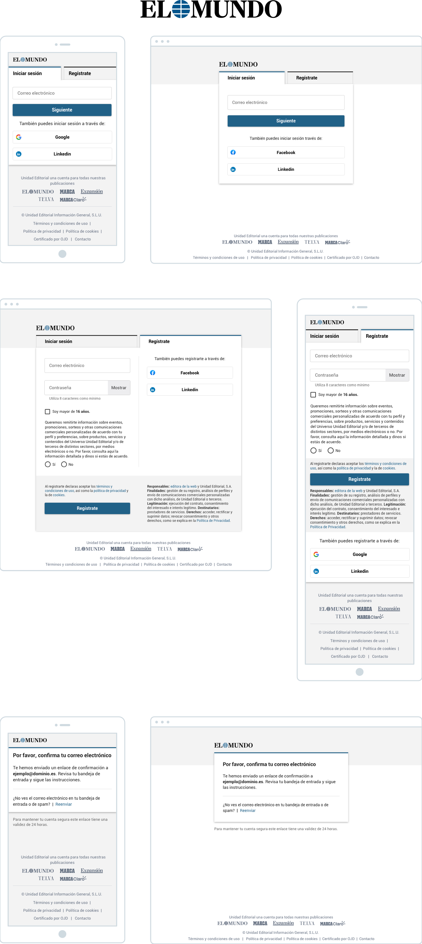
The following, we will present as an example the final result of the visual design of the login and registration process in El Mundo. This example illustrates how the design system has been applied to achieve an appearance and functionality consistent with the look & feel of the portal.
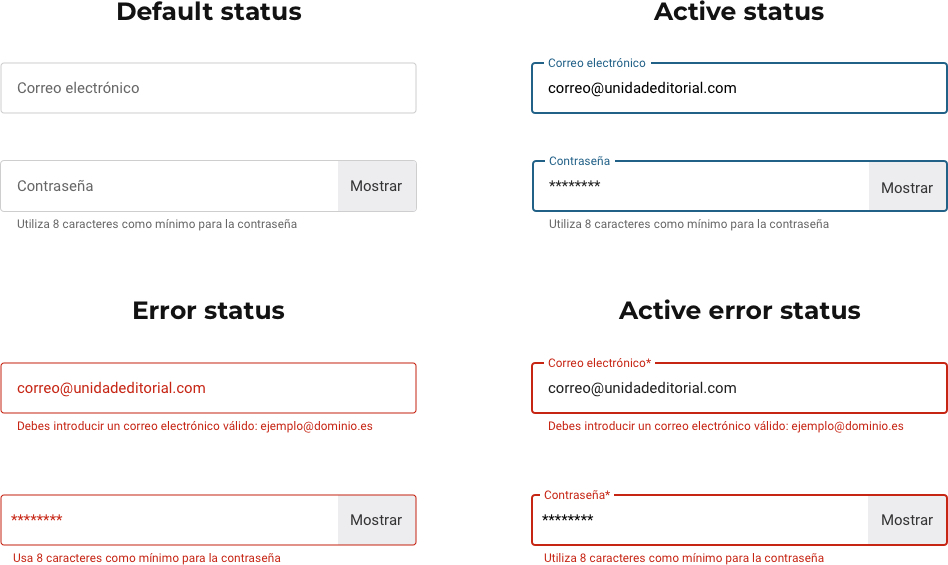
Inputs and buttons, including all their states, were designed following the guidelines set out in the Material Design guidelines. This approach ensures a coherent and modern interface, aligned with best design practices to improve the user experience.
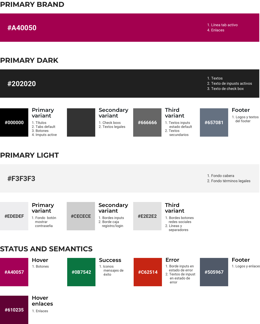
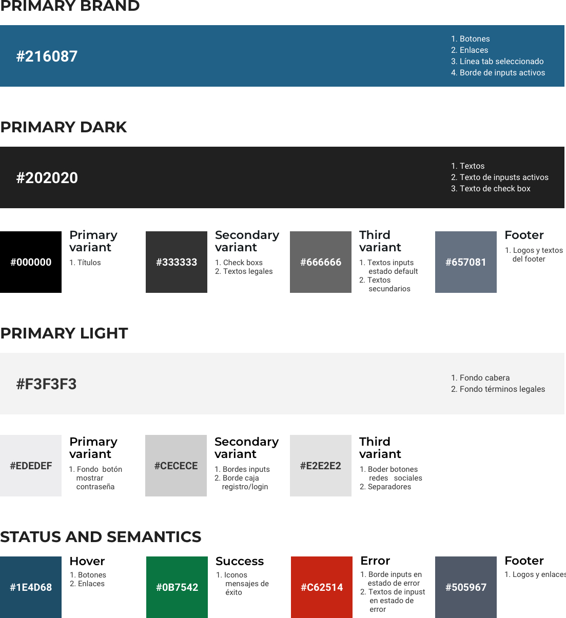
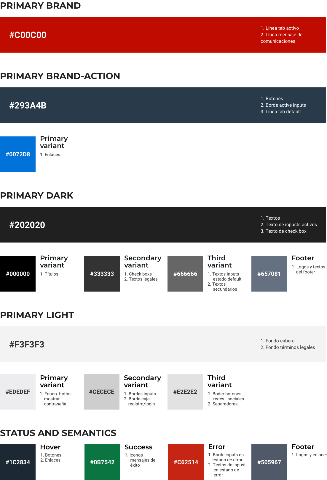
A detailed colour palette was developed, including all definitions and guidelines for use, consisting of:
By detailing the use of each colour in the variables, the customisation of the different web portals is facilitated. This specification allows the colour palette to be adapted coherently and efficiently to the needs and characteristics of each portal, guaranteeing a uniform user experience aligned with the visual identity of each one.
The following is the final result for the main login and registration screens, applying all the elements and guidelines previously defined. This design reflects the implementation of the colour palette, typography, and interface components developed, ensuring a coherent user experience aligned with the established standards.
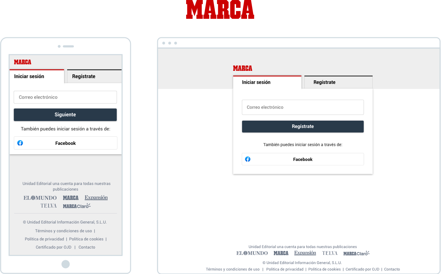
Below is the result for the main login and registration screens, where the new design variables have been implemented. These adjustments have allowed a customised adaptation for Marca, aligning the design with the visual identity and the specific requirements of the portal.
For the business daily Expansión, a similar process was carried out as for the other portals. . Thanks to the update of the colour variables, it is now possible to see the ellook & fee characteristic of their website, reflecting their visual identity and adapting the design to their specific needs.
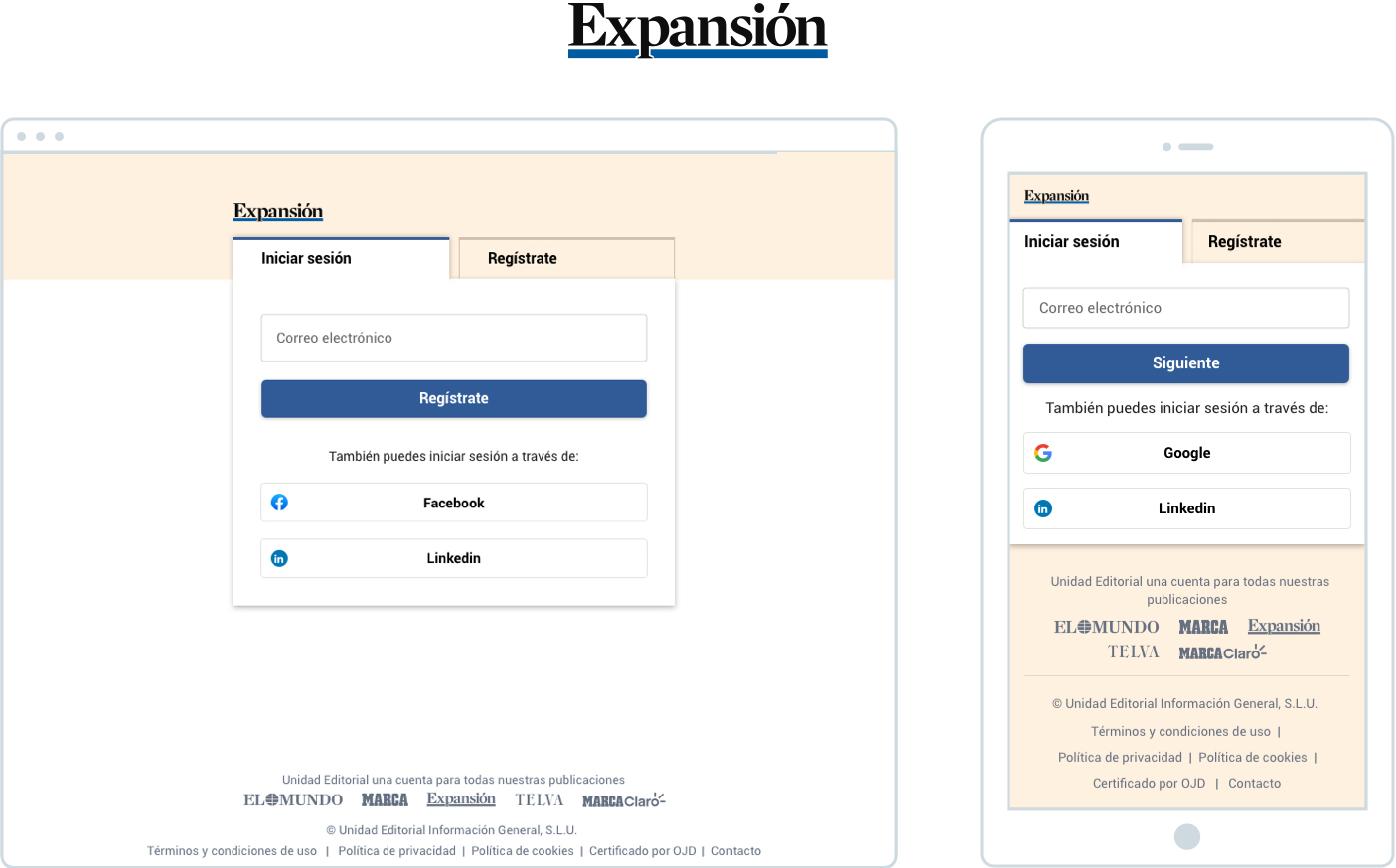

Below is the final result of the main screens for login and registration, integrating all previously established specifications and guidelines. This approach ensures that every element, from colours to typography to interface components, conforms to the defined requirements, providing a consistent user experience that is well aligned with the desired design.
