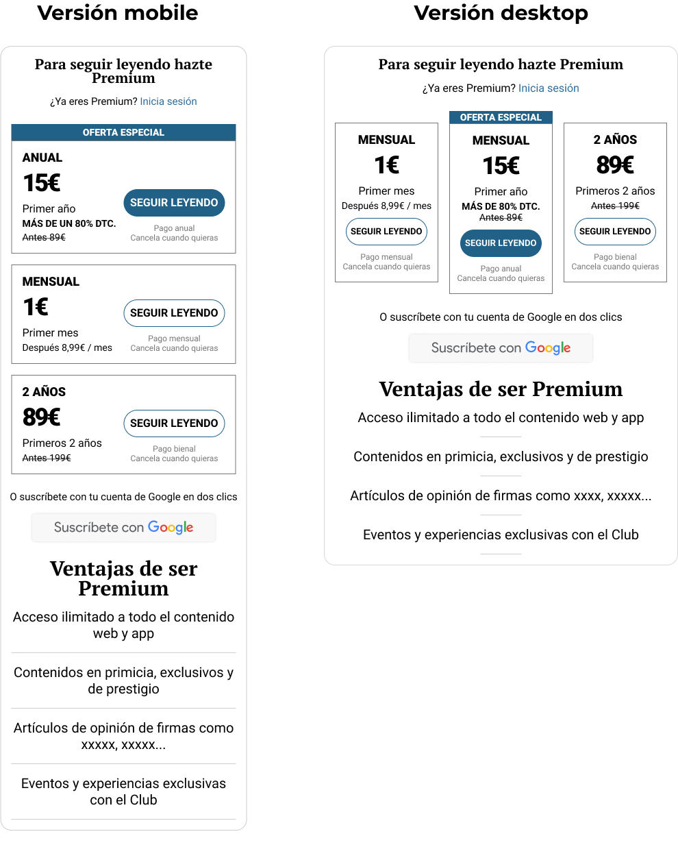
The designs and prototypes are visual references of the process, the final designs are not shown due to the client's product rights
Today, many online newspapers have adopted a monetization model that includes a paywall, what means that a paywall limits access to full content.
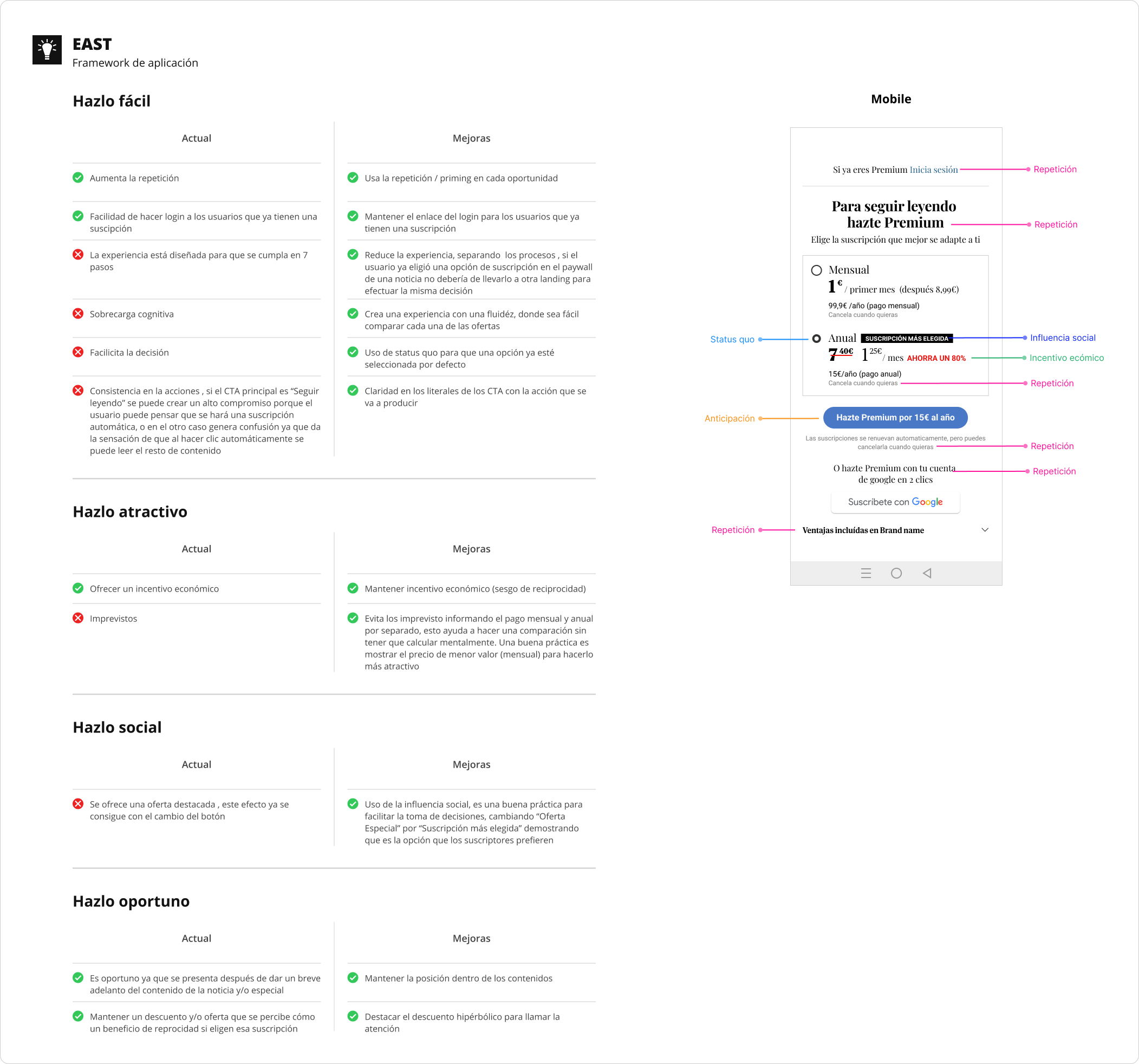
When presenting and comparing the prices of a subscription, it is essential that the user can clearly understand the differences between each option to facilitate their decision-making.
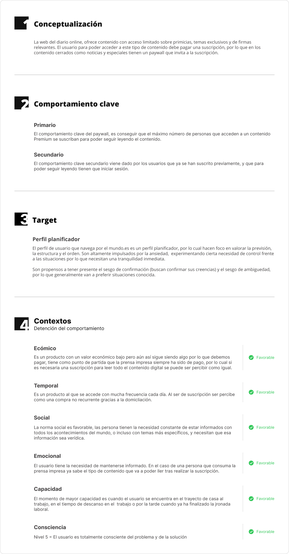
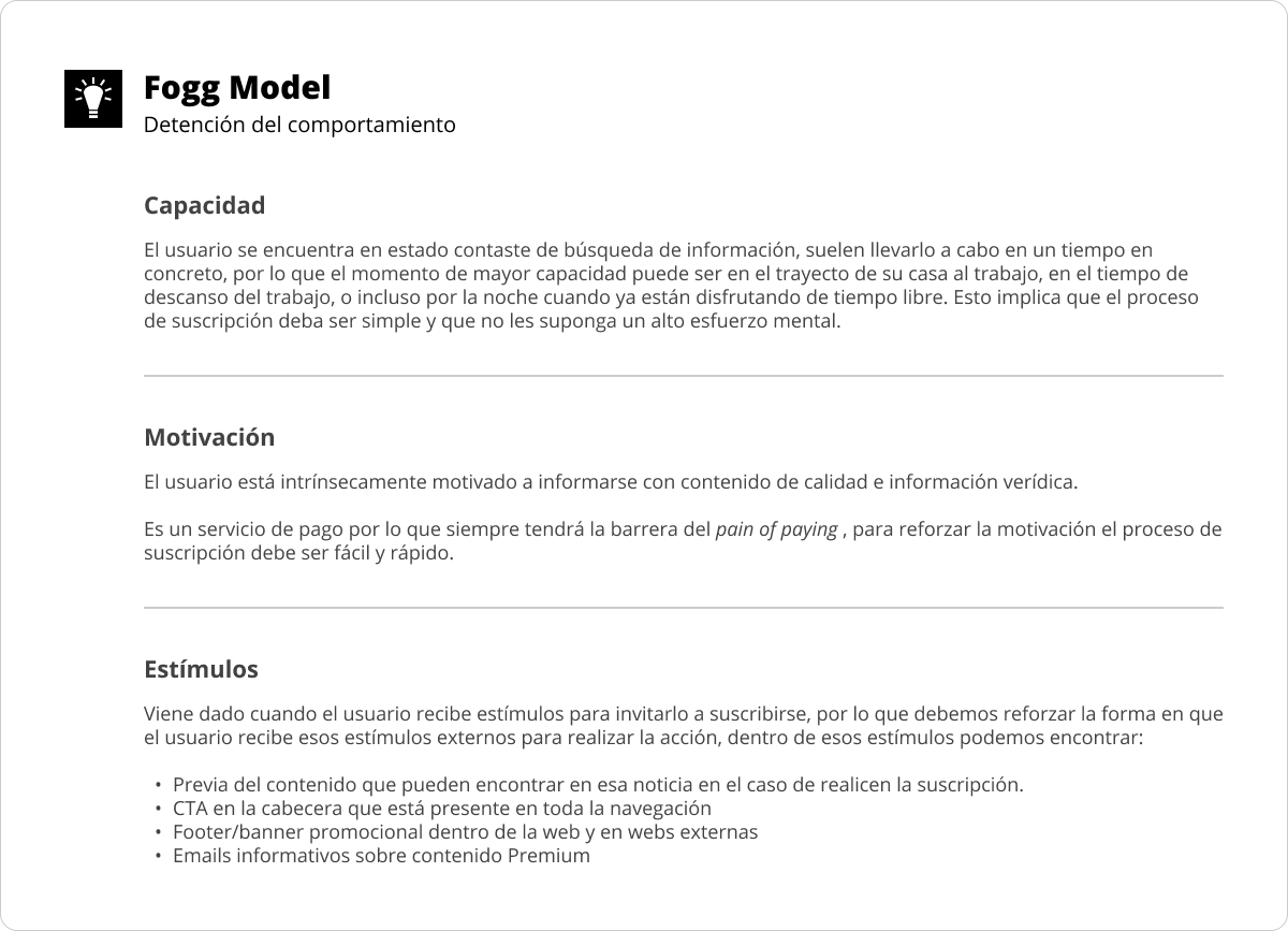
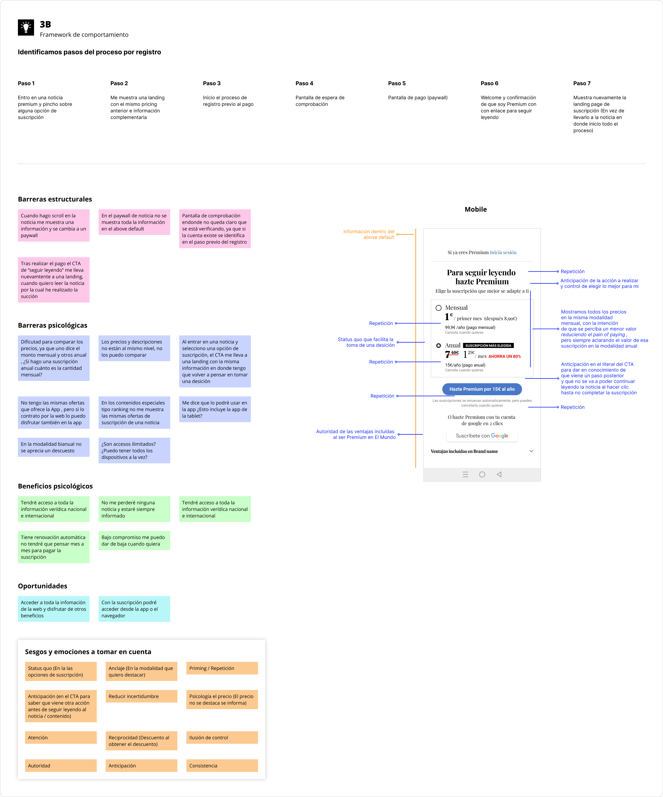
To develop the paywall design, we started from principles of cognitive psychology and behavioral science. This included conceptualizing the digital product, identifying key behaviors, and adapting contexts (changing the context can influence actions). In addition, two frameworks were applied: the< span class="bold"> EAST model to detect behaviors and the 3B model to break down barriers.
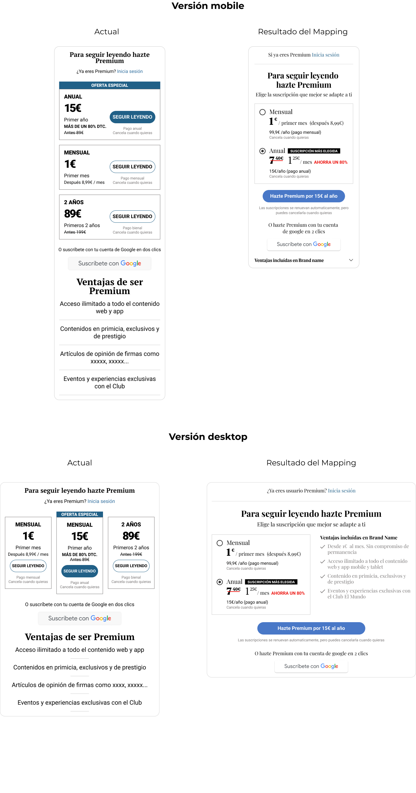
In the current paywall design for the mobile web and desktop web versions, elements that needed improvement were identified:
1. Cognitive overload
The paywall uses various fonts that are not properly applied to establish a clear hierarchy of elements. In addition, the elements are not aligned correctly, making it difficult to compare between the three subscription options.
2. Fatigue in decision-making
Prices are not presented in a uniform manner, forcing the user to perform mental calculations to determine the true cost of each option.
3. Lack of clarity
The "Continue reading" CTA generates confusion, as it suggests that clicking will take you to all the content. However, to do so, the user must first complete a registration process.
